
The Design System Your Direct Booking Site Is Missing

Bart — GuestIntro team
You spent a good chunk of change on a direct booking website you're proud of. The homepage hero looks beautiful on your 27-inch monitor.
Then a guest opens it on an iPhone.
The hero image crops the wrong half of your villa. The booking widget loads in a different typeface to the rest of the page. The "Check Availability" button — the only thing that actually matters — has slid below three lines of awkwardly wrapped text. The price font on the property card is suddenly bigger than the property name.
Your guest is back on Airbnb in nine seconds.
That's what happens when a direct booking site doesn't have a design system. And it's the single biggest reason hosts (and even some agencies) lose to the OTAs they're meant to replace.
What a Design System Actually Is
A design system is a set of rules that govern how a brand looks and works across every place a guest meets it. Colours. Typography. Spacing. Button styles. How photos are cropped. How forms behave. How the booking widget sits inside a page. How the calendar reads on a phone versus a desktop.
The point isn't aesthetic. The point is that decisions get made once, then reused.
Without one, every page on your site is a fresh argument about what colour the "Book Now" button should be. Every email looks like it came from a different company. Every new property page borrows half its style from the last one and invents the other half on the fly.
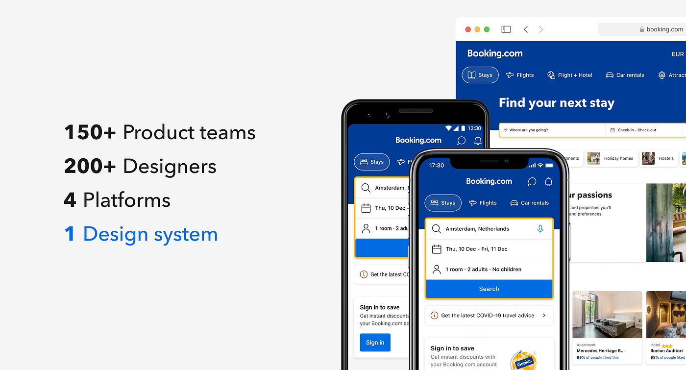
Airbnb has a design system. Booking.com has a design system. Vrbo has a design system. Each of them has entire teams maintaining it.
When you go up against those sites with a Squarespace template and a logo your cousin made, this is what you're really up against. Not the brand power. The consistency machine behind it.
Why "Just Get a Designer" Isn't the Answer
Here's the trap most hosts fall into. They hire a designer (or use Lodgify, or Hostfully, or Wix), get a homepage they like, and call it done.
Then they add a second property. Then a third. Then they realise the booking flow lives on a subdomain and looks nothing like the rest of the site. Then they make an Instagram graphic and pick a slightly different shade of green. Then they send a guest email and use a different font because the email tool doesn't have the one they wanted.
Six months in, the brand looks like five people working from different briefs. Which, in effect, is what happened.
A designer makes things. A design system makes the rules that govern what gets made, so that the third property, the booking confirmation email, the welcome sign at the door, and your Instagram all feel like they came from the same place.
This is the part most "vacation rental website design" guides skip. They tell you to "be consistent" and leave it at that. Consistent how? Across what? Maintained by who? Updated when something breaks?
That's the job of a system, not a brief.
Visual Inconsistency Reads as "Is This Site Safe?"
Here's the part that matters for direct bookings specifically.
You're asking a stranger on the internet to put their credit card into a form on a website they've never used, for a property they've never seen, run by a person they don't know. That's a high-trust transaction. Airbnb gets away with it because they've spent a billion dollars teaching people that the Airbnb logo means safe.
You don't have a billion dollars. So how do you signal safety?
You signal it the same way every legitimate business does. By looking the same on every page, every screen, every channel.
When the property page has rounded buttons and the booking widget has square ones, guests don't think "interesting design choice." They think — usually unconsciously — that something is off. When the confirmation email uses a slightly different shade of your brand colour than the website, they don't notice the colour. They notice that something doesn't add up.
This is the trust tax of inconsistency. On direct booking sites it kills conversions before guests can even articulate why they bounced.
A design system is the cheapest way to look trustworthy without being a billion-dollar brand.
What a Design System Looks Like for a Vacation Rental Brand
Let's get concrete. A working design system for a small-to-mid hospitality brand typically covers six things:
1. Brand tokens. Two or three primary colours with exact hex values. One accent colour. One typeface for headings, one for body. A handful of type sizes that get used everywhere. Specific spacing values (8px, 16px, 24px, 48px — pick a scale and stick to it).
2. Photography rules. What gets photographed (hero shots, detail shots, lifestyle shots, neighbourhood shots). How they're cropped (16:9 for heroes, 4:5 for property cards, square for social). How they're edited (warm but not orange; bright but not blown out). The single biggest design weakness across vacation rental brands is photo inconsistency. One property shot at golden hour next to another shot at midday with a phone. The system fixes this.
3. Component library. Buttons (primary, secondary, ghost). Property cards. Booking widgets. Navigation. Forms. Each one has an exact specification — colour, padding, hover state, mobile behaviour — that gets reused across every page.
4. Page templates. The homepage. The property page. The booking flow. The thank-you page. The post-booking confirmation page. Each template uses the components above in a predictable way, so a new property page in six months looks like the old one.
5. Email and document styles. Confirmation emails. Pre-arrival emails. Your digital house manual. Your guidebook. They all use the same tokens as the website. Same green. Same headline font. Same photo crops.
6. Voice and tone rules. How you write. What you call your guests. Whether you use contractions. Whether the welcome message is warm and chatty or polite and professional. This isn't strictly "visual," but if you skip it, the design system fixes the look and the words drift instead. Guests notice that just as quickly.
Six categories. Most hosts don't need more.
Where Most Hosts Get This Wrong
A few patterns repeat across hundreds of direct booking sites I've looked at:
They confuse a logo with a brand. A logo is one component of a brand. A brand is everything a guest sees, reads, and feels across a dozen touchpoints. Spending three weeks on a logo and then picking Canva templates for everything else is the most common mistake in this space.
They let tools dictate the system. "We're using Lodgify, so the booking widget looks like that and we have to accept it." No. You design the system first, then make the tools fit it — even if that means restyling the widget with custom CSS or moving to a builder that gives you more control.
They never write the rules down. A design system that lives in one person's head is just preference. The moment that person hands off to a VA, a designer, or a property manager, the rules evaporate. Write them down. One Notion page is enough to start.
They treat mobile as an afterthought. This is the killer. Over half of guests open your site on a phone, and most direct booking sites are designed desktop-first and then "made responsive." Which means the system breaks the moment the screen narrows. Mobile is the primary canvas now. Design there first.
They build it once and abandon it. Treat a design system as a practice, not a one-off project. Every new property, every new email template, every new social post is a chance to either reinforce the system or quietly erode it.
Pick Your Path: Hosted or Bespoke
There are two sensible ways to get a design-systemed direct booking site. The one you pick depends entirely on the size of your operation.
If you have one property, or a single villa with a few rooms. Building a bespoke system from scratch is overkill. You need a direct booking site where the system is already done for you. Typography, spacing, button behaviour, mobile layout, booking flow. All decided by people who do this for a living.
That's what GuestIntro's new direct booking websites are built for. The visual system is baked in. Your photos, your property details, and your guidebook all render through the same set of components, so everything looks like one continuous brand from the first time a guest lands on your site to the moment they walk through your front door. You don't need to specify padding values or worry about how the booking widget behaves at 390 pixels. That work is already done.
For most hosts in this size bracket, this is the right answer. Lower cost, lower risk, no rebuild required when you add a second listing later.
If you have a portfolio of properties or a growing PM business. The calculation shifts. At five or more properties, or if you're building a brand you eventually want to sell, design debt compounds fast. Every property added without a system multiplies the inconsistency, and rebuilding later costs more than building right.
This is where it makes sense to bring in a design systems agency and commission a bespoke site. The deliverable isn't a pretty homepage. It's the tokens, components, and rules that let you build twenty pretty homepages, plus emails, signage, guidebooks, and social posts, without reinventing the wheel each time. Consider this an investment that will lead to higher direct-booking conversion and lower rebuild costs.

Most hosts belong on one of these two paths. The mistake is sitting in the middle: paying a freelance designer to build a one-off homepage with no system underneath, then trying to bolt three more properties onto it eight months later. That's where design debt actually hurts.
How a Design System Connects to Your Guest Experience
Here's the part that ties everything together. And the part that no other article in this space is telling you.
Your direct booking site isn't the whole brand. It's roughly a third of it. The other two-thirds are everything that happens after the booking: the confirmation email, the pre-arrival message, the check-in instructions, the digital guidebook, the welcome sign at the door, the checkout reminder.
A guest's perception of your brand is the sum of all those touchpoints. If your website is sharp but your confirmation email is a stock template from your booking tool, the brand drops at the booking step. If your guidebook is hosted somewhere that uses a different font and colour palette to your site, the brand drops the day before arrival. By the time the guest has actually arrived, your "premium" brand has been quietly downgraded three times in their head.
This is where the design system pays for itself. The same tokens that make your website feel premium also make your guidebook feel premium. The same component logic that produces a clean property card also produces a clean check-in screen.
GuestIntro was built around this idea. The direct booking website, the guidebook, the guest messages, the check-in instructions, the welcome content — all rendered through the same components, with consistent typography, spacing, and colour. A guest who books through your direct site gets a post-booking experience that feels like the same brand from search result to checkout. Not a handoff to three different apps.
That continuity is what separates direct booking sites that win repeat guests from direct booking sites that look polished for thirty seconds and then collapse the moment the guest opens an email.
The Mobile-First Reality
Back to where we started.
The site that loses to Airbnb on a phone isn't losing because it has bad fonts. It's losing because nobody made a single coherent decision about how the brand behaves on a 390-pixel screen.
A design system makes that decision once. The hero crops to portrait below 768 pixels. The booking widget stacks vertically below 600. The primary button stays 48 pixels tall on every screen so it's always thumb-friendly. The price uses the same scale across all property cards regardless of screen. The header collapses to a hamburger at a specific breakpoint, with specific spacing, in the same colour as the desktop nav.
Decide it once. Apply it everywhere. Never debate it again.
That's the whole point.
Where to Start This Week
Whichever path you choose, do this exercise first. An hour, a Notion doc, a willingness to write things down.
If you're going bespoke, this is the v1 brief you'll hand to your agency. If you're going with a hosted product like GuestIntro, the platform handles colours, type, and components, which means the editorial layer (photo rules and voice) is where you'll put most of your energy. Either way:
Colours. Three hex codes. One primary, one secondary, one accent. That's it for now.
Type. One heading font. One body font. Four sizes (e.g. 32px, 24px, 18px, 16px). Pick them, list them.
Buttons. One primary style (filled, your primary colour, white text). One secondary (outline, your primary colour). One ghost (text only). Specify padding, corner radius, hover state.
Photo rules. Three sentences. What you shoot. How you crop. How you edit. Three example photos that get it right.
Voice. Three sentences. How you address guests. The contractions and tone you use. Words you avoid.
That's v1. It's enough to make your existing site, your next property page, your next email, and your next Instagram post all feel like one brand.
If you grow past three or four properties and find yourself rebuilding the same component a fifth time, that's the signal to graduate from hosted to bespoke. By that point you'll have something concrete to hand to whoever helps you build it. Which makes the work cheaper, faster, and a lot less argumentative.
The Bottom Line
The vacation rental brands beating OTAs at direct booking aren't winning because they have prettier websites. They're winning because every touchpoint (site, email, guidebook, check-in, signage) feels like one continuous experience.
A design system is what makes that continuity possible without a full-time design team. It's the cheapest way to look like a real brand instead of a Squarespace template with good photos. And in a market where guests are deciding whether to trust you with their card in under ten seconds, it's the single highest-leverage thing you can build into your direct booking strategy.
If you've got one property or a small villa, use a hosted direct booking site where the design system is already built in. GuestIntro starts at $19.99/month and is built for exactly this size of operation. If you're scaling a portfolio, commission a bespoke site with a real design system underneath, ideally with an agency that does this for a living. Don't sit in the middle paying for a homepage with nothing behind it.
Just don't keep paying the trust tax of inconsistency. Your guests are already counting.


